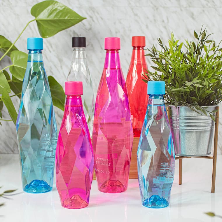
In the complex world of business, where every detail counts, corporate water bottle design emerges as a strategic tool to communicate messages through the science of colour. The choice of shades goes beyond aesthetics; it is an emotional and psychological journey that impacts brand perception. In this in-depth analysis, we will explore how colour influences custom bottle design, from the psychology behind it to the power of brand consistency, the selection of resonant colours and the emotional impact that can forge lasting connections.
Colour Psychology in Bottle Design

The psychology of colour is a fascinating discipline that reveals how different shades affect our emotions and perceptions. Applied to corporate water bottle design, this science becomes a valuable tool for communicating values and generating specific emotional responses. How does light blue impact the perception of your brand, and what feelings does green evoke in consumers? The choice of colour is not arbitrary; it is a deliberate strategy to influence brand perception and customer experience.
The subtlety of colour in bottle design can influence the consumer's mood. Warm tones such as red and orange can evoke energy and vitality, while cooler colours such as blue and green can convey calm and health. Understanding these emotional associations is essential to selecting colours that align with brand identity and values. The science of colour teaches us that every choice has a purpose, and in corporate water bottle design, that purpose is to generate a positive emotional response.
The Power of Brand Consistency in Colour
Brand consistency is a fundamental pillar in building a strong and recognisable visual identity. In corporate bottle design, colour plays a crucial role in maintaining that consistency. The colour palette used, from the tone of the logo to the secondary colours present on labels and caps, contributes significantly to the visual identity of the brand. Consistent application of colour creates an instant visual connection to the brand, facilitating recognition and recall.
Brand consistency is a fundamental pillar in building a strong and recognisable visual identity. In corporate bottle design, colour plays a crucial role in maintaining that consistency. The colour palette used, from the tone of the logo to the secondary colours present on labels and caps, contributes significantly to the visual identity of the brand. Consistent application of colour creates an instant visual connection to the brand, facilitating recognition and recall.
How to Choose Colours that Resonate with Your Audience
An emotional connection with your audience is essential to build strong and lasting relationships. In corporate bottle design, colour choice can be a powerful tool to grab the attention of your target audience. How do your potential customers perceive different colours? What cultural and emotional associations do they have with certain shades? These questions are crucial to selecting colours that are not only visually appealing, but also resonate with the identity and values of the audience.
Colour science teaches us that each shade has a specific psychological impact. For example, green can be associated with freshness and health, while yellow can convey cheerfulness and positivity. By understanding these associations, you can choose colours that generate specific emotional responses in your audience. Designing corporate water bottles with colours that resonate with the audience will not only appeal visually, but also create an emotional connection that goes beyond surface appearance.
Emotional Impact: Creating Connections Through Colour
Colour has the power to evoke emotions and create memorable experiences. In corporate bottle design, this ability becomes a strategic tool to differentiate and leave a lasting impression. Colour choice is not just about aesthetics, but about storytelling, conveying values and connecting emotionally with the audience. From the choice of colours on the label to the perfect match on the closure, every detail counts in creating a sensory experience that goes beyond the mere functionality of the packaging.
When colour is used strategically, it can transform your corporate water bottles into emotional message carriers. What do you want to communicate to your customers? How do you want them to feel when interacting with your products? Bottle design can become a storytelling tool, where each colour tells a part of your brand's story. The emotional impact of colour goes beyond the first impression; it creates connections that last and contribute to customer loyalty.
In conclusion, the science of colour in corporate bottle design is not just a matter of aesthetics, it is an integral strategy to communicate, differentiate and connect emotionally with the audience. From the psychology behind each hue to the power of brand consistency, the choice of resonant colours and emotional impact, each aspect contributes to the creation of bottles that are not only visually appealing, but also carry meaning. Dive into the palette of possibilities and make your bottles stand out in a saturated marketplace, where colour becomes the language that tells the story of your brand.
